

In this Kibana dashboard tutorial, we will look at the important Kibana concepts involved in the creation of different Kibana dashboards and visualizations.
Kibana is an open-source tool that helps in search and data visualization capabilities. We have covered the Kibana basics in our Kubernetes EFK stack tutorial. Take a look at the EFK stack guide to understand how Kibana interacts with Elasticsearch. Also, in our DevOps Engineers Guide, we have covered the importance of logging in an organization.
We will also look at some of the examples of Kibana dashboards to better understand all the visualizing concepts.
Kibana Dashboard Tutorial for Beginners
When it comes to troubleshooting, it is essential to have logging dashboards and log search functionalities that help developers and DevOps engineers troubleshoot applications and infrastructure issues in real-time.
In this guide, we are going to learn the following.
Importing Kibana Sample Data
To get started, we need data in Kibana. The good news is, Kibana comes pre-loaded with some sample data. We are going to use it to learn to create Kibana dashboards.
Let's go ahead and import the sample data into Kibana to create visualizations. Follow the steps given below to import the sample data.
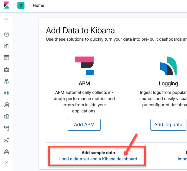
Step 1: To get the sample data, go to the Kibana home. Sample URL: http://<node-ip>:30000/app/kibana#/home. Click the Load a data set option as shown below.
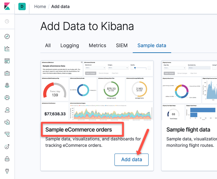
Step 2: Load the 'Sample eCommerce orders' data by clicking the "Add data" option. This is the data that we are going to use for dashboards.
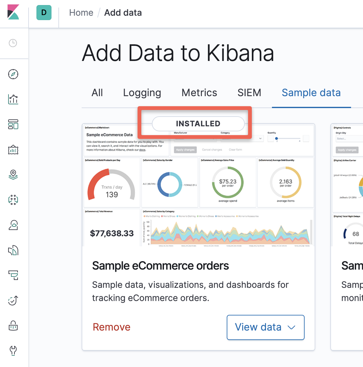
Once the data is added, you should see the installed option as shown below.
Let's look at the popular visualizations and create some visualizations for our sample data. After this, we will create our dashboards.
Open the visualization section inside Kibana for this.
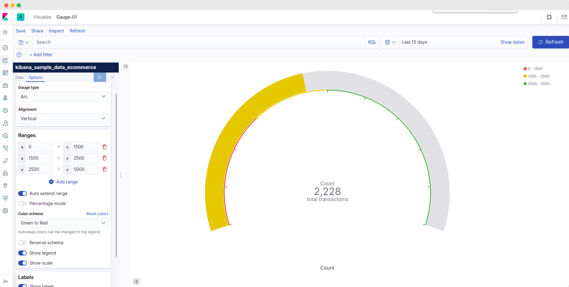
Understaning Kibana Gauge
Let's understand the concept of Gauge in Kibana.
- What does Kibana gauge signify? It indicates the status of the metric.
- How is it usable? It displays the metric against a 'range,' i.e., it depicts a comparison of current value to a predetermined lower and upper limit.
- How will we use it? Let's use it to signify the volume of business in a given time frame. Next, we will use the 'range' settings to signify business state.
Since each log indicates a transaction - we can assume that a higher no. of such logs means higher business transactions.
We will use colors such as Red, Yellow, and Green to indicate poor, average, and good business performance in the time frame.
Steps to create Gauge Visualization
- Create a gauge visualization.
- Add a metric with aggregation as count.
- Save the visualization.
Additional features: It has several other settings that help in creating better visualizations like:
- type: to create a complete circle or a semi-circle.
- alignment: to control horizontal or vertical display styles.
- color-schemes: to control the color for each range, try it by clicking on the color in the legend.
- sub-levels: to control the text being displayed inside the visualization.
Undestanding Kibana Metrics
Let's understand the concept of Metrics in Kibana.
- What does Kibana metrics signify: It displays a calculation as a single figure.
- How is it usable: It has the capability to display any metric and also perform calculations of it.
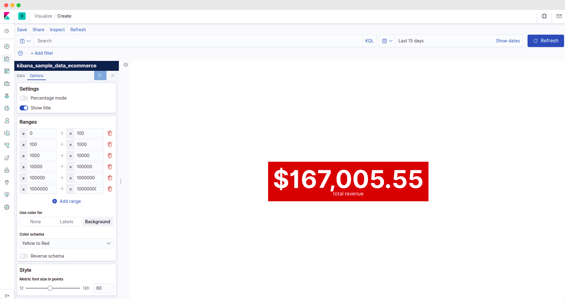
- How will we use it: Let's use it to display the overall total revenue of the business (sum of
taxful_total_price) and the total revenue from each customer (sum oftaxful_total_pricegrouped by customer's email address)
This will help the business find out which customer is spending more at their store!
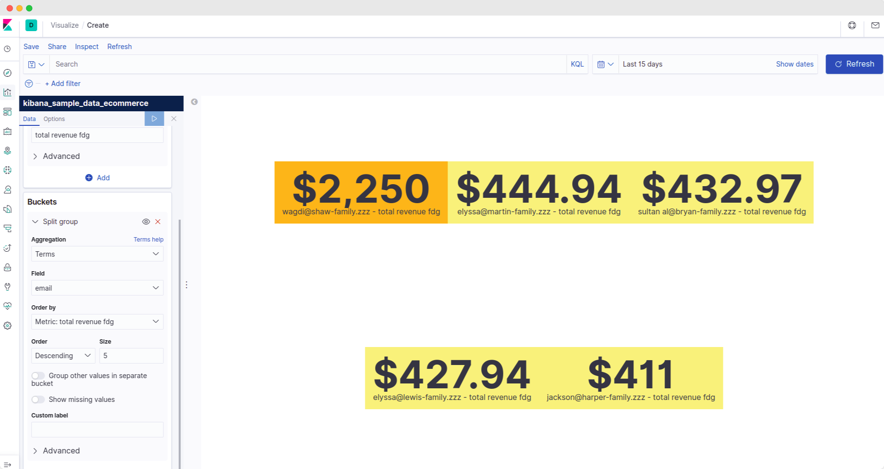
We will display the revenue from the top 5 customers at a given time.
Steps to create Kibana Metric Visualization
- Create a metrics visualization.
- Add a metric. Select aggregation as 'sum' and field as 'taxful_total_price'.
- Save this visualization as 'metric-01'.
- Add a bucket - 'split group'. Select aggregation as 'terms' and field as 'email'.
- This will now display results split by customer emails.
- Save this visualization as a new visualization.
Additional Features
It has several other settings that help in creating better visualizations like:
- buckets: to group data according to another field (e.g., email)
- label: to control the text being displayed inside the visualization.
- ranges: to treat values in a given range as per its significance,
- e.g. total revenue in the range 0-100 is low and total revenue in the range of 100000-1000000 is high - so we can assign colors differently using this feature.
- color-schema: to control the color displayed in the visualization as per the ranges.
To split data by customer's email,
Create a new visualization for total revenue and modify it -
- Add a bucket (split group)
- Add aggregation of 'terms'. We use terms when we want to use a custom field like email.
- Select 'email' as the field.
Kibana Controller
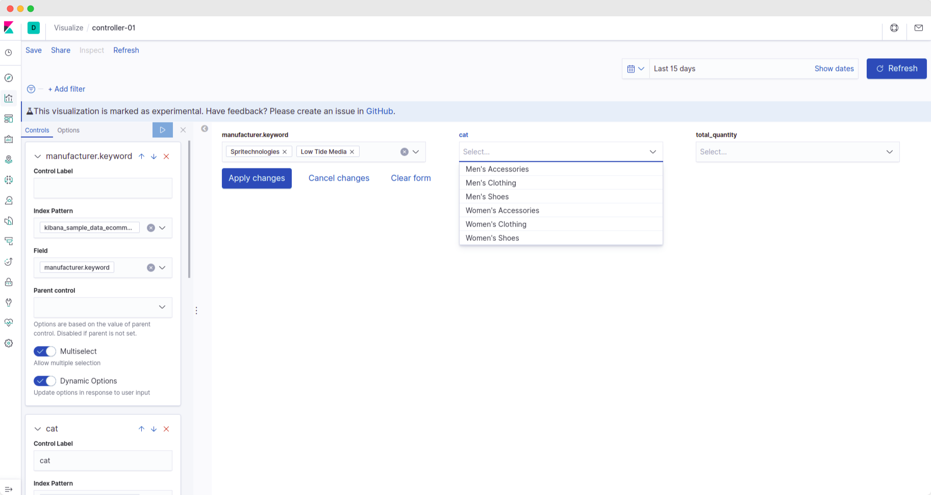
- What it signifies? It creates interactive controls for easy manipulation of the dashboard data.
- How is it usable? It has the capability to apply filters to the visualizations inside a dashboard.
- How will we use it? Let's use it to filter the logs based on important fields like manufacturer, category, and quantity.
We will display the logs by creating a saved query and importing it into our dashboard.
Steps to create:
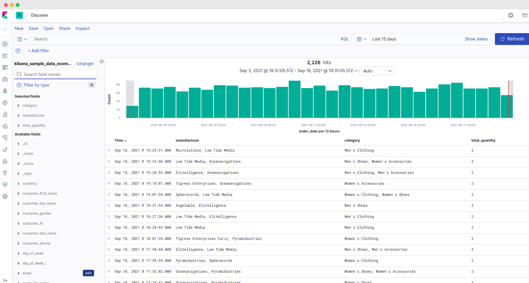
- Go to the discover tab.
- Add the required fields from the left-hand side options.
- You should see only the added field in the logs panel now.
- Save it by clicking on 'save.' (It's on the top side of the panel.
- Now let's try to create a controller. Create a controller visualization.
- Add an 'options list'. Select the index pattern & choose a field.
- Repeat step 6 for all the controller fields that you wish to add.
Additional features -
It has several other settings that help in better filtrations like:
parentcontrol: It's used to control the values of a field. Let us understand it with the help of an example.
The 'category' controller field has 'manufacturer' as the parent control, and the current value for the 'manufacturer' field is 'Low Tide Media.'
This implies that the 'category' field will have only those values for which 'manufacturer' is 'Low Tide Media.'
In this way, filtering becomes easier.
multiselect: This enables/disables the functionality to have multiple selections in the field. This also helps in filtering out.
E.g., let's say we want to look at logs where 'manufacturer' is 'Low Tide Media' and 'Spiritechnologies'. We can add both values if multiselect is enabled.
dynamic options: dynamically updates the options list according to user inputs.
control label: It controls the text being displayed inside the visualization.
Controllers are usually added to dashboards along with a saved query (Yes, you can add a saved query from discover into a Kibana dashboard as well!)
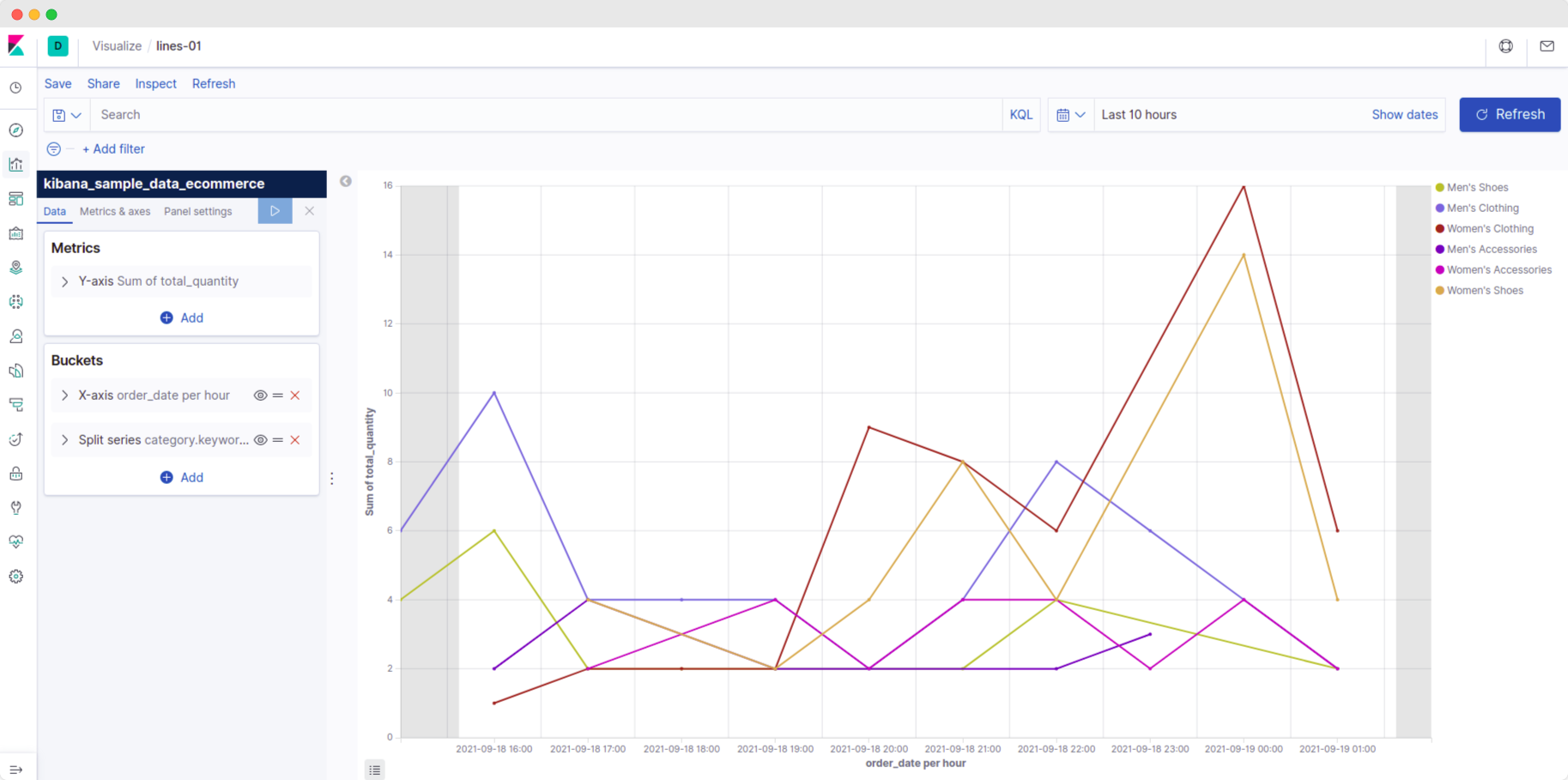
Lines
What it signifies?
It creates a visualization of trends in the data.
How is it usable?
It has the capability to plot various fields and apply basic calculations to the field such as sum, min, max.
How will we use it?
Let's use it to display the total_quantity of products for various dates; let us also group this information according to the product type, such as 'men's shoes' or 'women's clothing.
This type of filtering can help us understand the trends easily.
Steps to create:
- Create a line visualization.
- In the Y-axis, we will plot the sum of quantities. So let's select aggregation as 'sum' and field as 'total_quantity.'
- In the X-axis, we will display the trend as a histogram (It shows the distribution of data) with an interval of 1 hour. It means the data points will be taken on a per-hour basis.
- We wish to understand the trend for each product category separately. So let's split the data according to the product category.
To do this, add a 'split series' option and add a 'sub-aggregation' of 'terms' and select 'category' in the field. - Apply the changes by clicking on the 'play' button at the top of the panels.
Save it by clicking on 'save.' (It's on the top side of the panel.)
Additional features -
It has several other settings that help in better visualizations like:
grid: It's used to control the visibility of x and y-axis grids.
positions: It's used to control the placement of the x and y-axis.
customlabels: to control the text being displayed inside the visualization.
Apart from this, it has a lot of options for aggregations like average, min, max, etc.
This is the most commonly used visualization type! So I encourage you to explore this deeply.
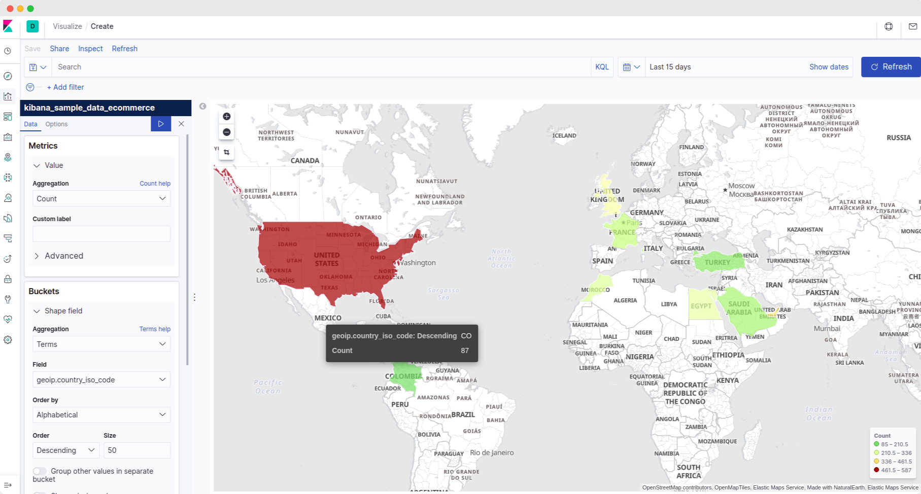
Region Map
What it signifies?
It shows metrics on a map.
How is it usable?
It gives a visualization over the world map! You can visualize your metrics on a per-country basis.
How will we use it?
Let's use it to display the transactions, i.e., the count of logs carried out in each country.
This type of filtering can help us get a 360' view.
Steps to create:
- Create a region map visualization.
- In the metrics section, we want to plot the count of logs for the countries, so let us select 'count' as the aggregation.
- We obviously want to see the count for each country separately. So let's create a bucket.
- We have a field called 'country_iso_code' that tells Kibana about each transaction log's country. So select 'terms' in the bucket's 'aggregation' and field as 'country_iso_code'.
- Increase the size to about 50 to see data for more countries.
Save it by clicking on 'save'. (It's on the top side of the panel.)
Additional features -
It has several other settings that help in better visualizations like:
vectormaps: It's used to specify different maps.
By default, the world map is displayed. But what if we want to visualize data related to just India. We can select 'India state and territories' in vectormap option.
It will display a detailed map of India with the state boundaries now.
Similarly, there are other options such as 'USA states' or 'Australia states'.
color-schema: to control the color displayed in the visualization as per the ranges.
border thickness: to control the line size by which Kibana draws the boundaries in the map.
How to Create a Kibana Dashboard?
A dashboard in Kibana is a collection of various visualizations. Here is an example dashboard.
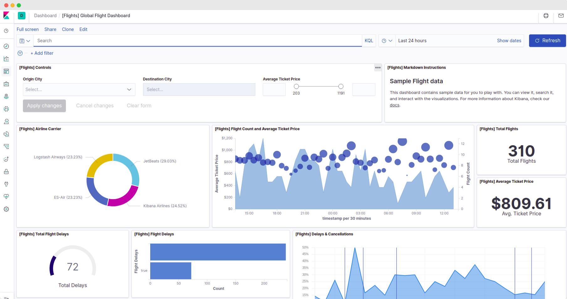
We will create a similar dashboard from the visualizations in the above section.
Steps to create a dashboard
- Head to the dashboard section of Kibana and create a new dashboard.
- Start adding the visualization and saved queries here.
That's it! You have created your very own first dashboard now! Save it for future use.
Next steps
In production environments, teams usually try to keep a backup of these visualizations and dashboards in a JSON file for safekeeping.
Steps to create a backup file:
- Go to Kibana's management section.
- Go to the saved objects tab.
- Select your visualizations and dashboards from the list.
- Export them. Kibana will create a JSON file for you and download it to your system.
Creating a backup is not enough; we also need to understand importing the objects through the file.
Steps to import an object using a backup file:
- Under the saved objects click on the Import button.
- Next, select your JSON backup file. Kibana will import them into its list now.
Besides backups, Kibana also has tons of features like anomaly detection using Machine Learning and functionalities to receive email & slack alerts. So be sure to explore them too!
Conclusion
EFK is a tool used by 100s of DevOps teams every day. In this EFK tutorial series, you have learned a very useful skill of creating a Kibana dashboard
There are many others; explore different options thoroughly to create the best visualizations!
In the next article, we will learn how to create Kibana dashboards for Kubernetes cluster monitoring.
Also, if you are learning about logging & monitoring, you might like my guide on setting up Prometheus on Kubernetes.
